언어/python
pandas + matplotlib 을 이용하여 tistory 방문 관련 pie 차트 그리기
파아랑새
2020. 8. 4. 06:43
수정 중 ( 내용 추가될 예정 - 8월4일 늦은 오후에... )
pandas 에서 수식(예를 들어 sum 과 같은)으로 작성된 셀 값은 nan 으로 처리 된다. (???)
import pandas as pd
from matplotlib import pyplot as plt
excel_file = "./test.xlsx"
data_frame = pd.read_excel(excel_file, sheet_name=0)
result = data_frame[["성별", "방문자수"]]
person = {"남자": 0, "여자": 0}
for x in result.values:
person[x[0]] = person[x[0]] + x[1]
eng_person = {"man": person["남자"], "woman": person["여자"]}
category = [x for x in eng_person.keys()]
data = [eng_person[y] for y in category]
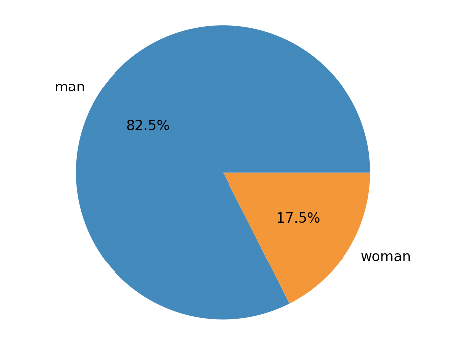
plt.pie(data, labels=category, autopct="%0.1f%%")
plt.show()
[ 엑셀 구조 ]

[ pie chart ]